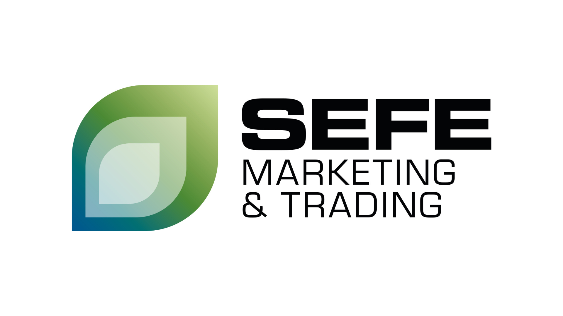
On Tuesday, 11 October, SM&T – along with others in the SEFE Group, including SEFE GmbH, SEFE Energy, SEFE Mobility and SEFE Switzerland – made its next step towards the future with the presentation of its new logo.

This logo marks the start of a new chapter, as the Group continues to build its brand identity after renaming this summer.
The SEFE Group logo concept signifies our identity and mission in the energy markets, now and for the future. Our core mission – encapsulated in our name – is to Secure Energy for Europe (“SEFE”). This is a powerful and bold statement of intent and action.
SEFE leverages its sophisticated capabilities to ensure reliable energy flows. We span oceans and continents to reach customers, steering a path towards a sustainable energy future.
The icon in our logo – a gas flame transitioning into a leaf – symbolises the evolution of our business to deliver a low carbon economy. The blue colour reflects our reputation as a trusted and reliable partner that fulfils its promises across society. The green stands for our aspiration of renewal and growth.
“The introduction of our logo marks a new era for the SEFE Group of companies. This not only reflects our commitment to being a reliable partner in the current energy crisis, but also our promise to play a leading role in steering a path towards a sustainable energy industry”, explains Dr Egbert Laege, CEO of SEFE Group.
SEFE Group companies that have not been renamed will retain their existing brand.
SEFE Marketing & Trading Limited
20 Triton Street, NW1 3BF, London
communications@sefe-mt.com


